Sandwich N Co
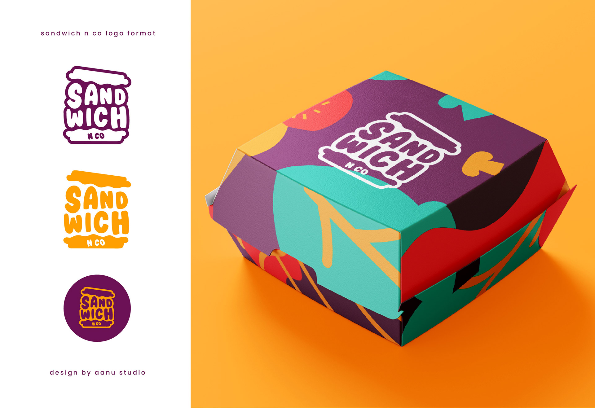
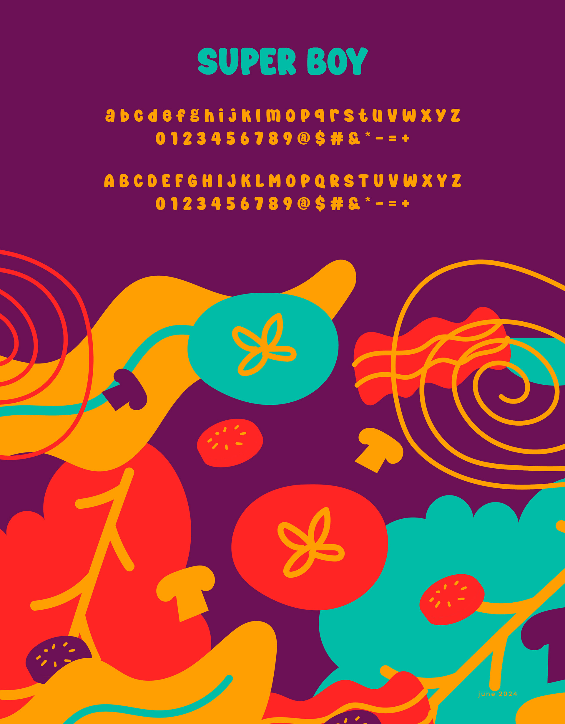
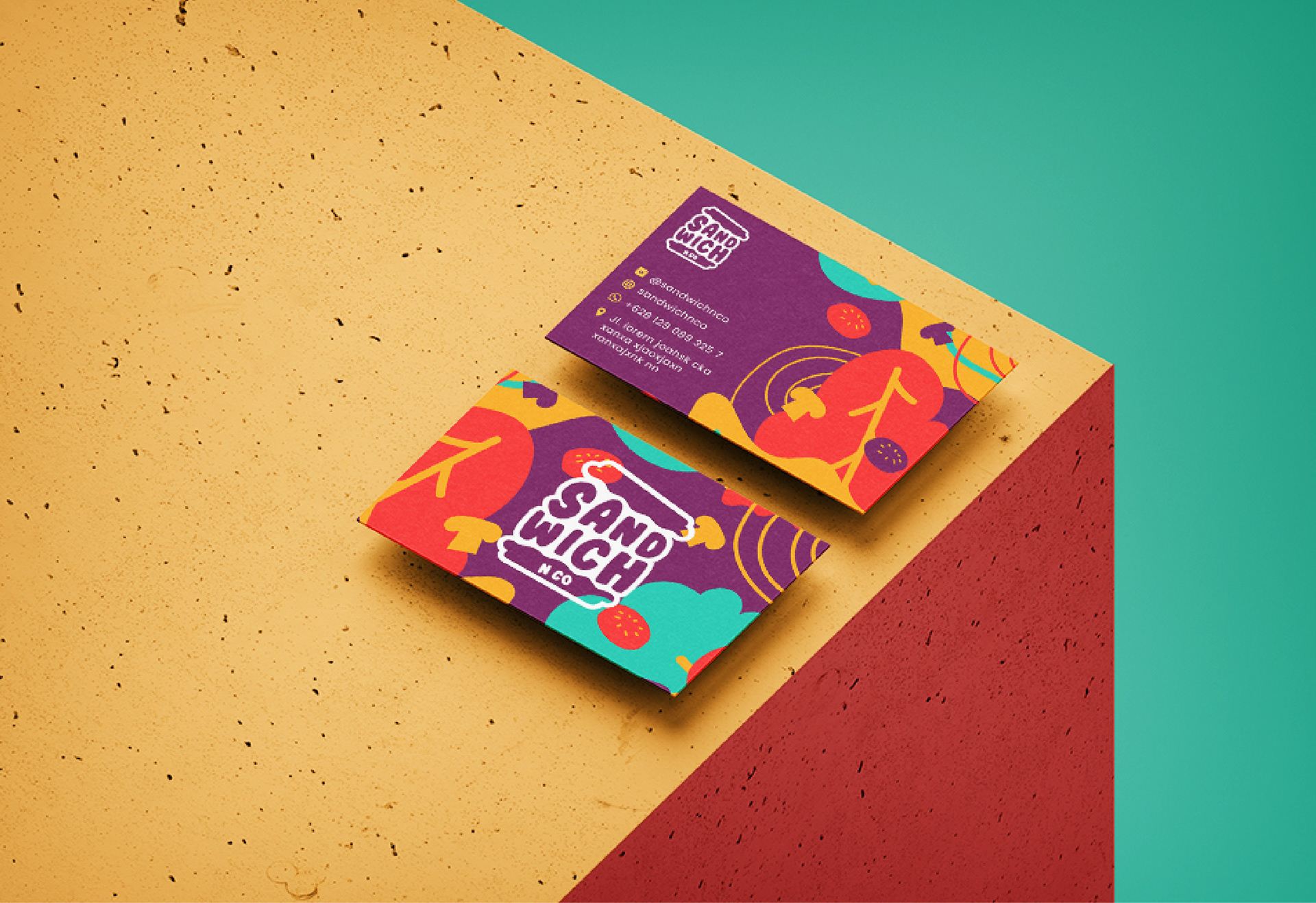
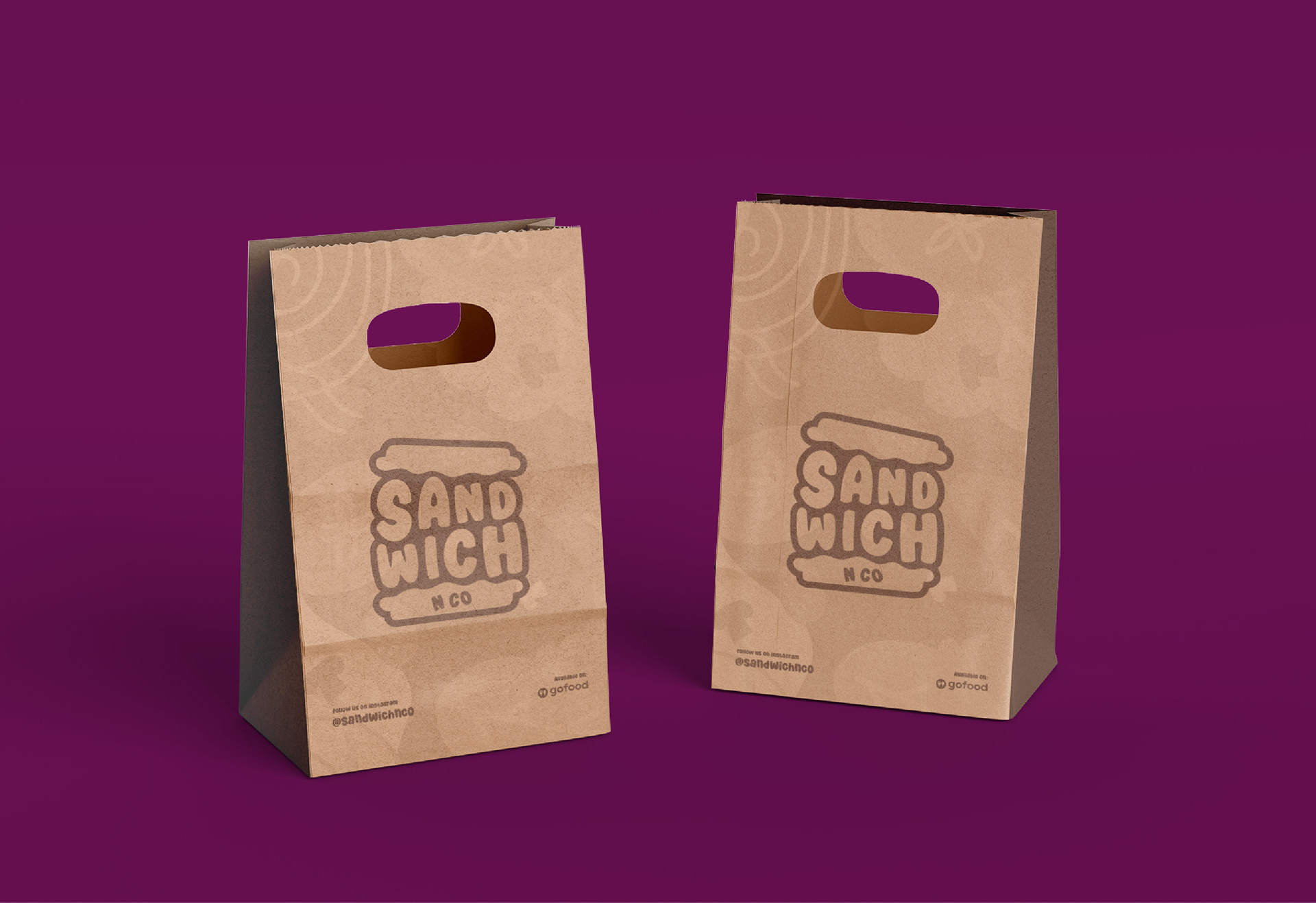
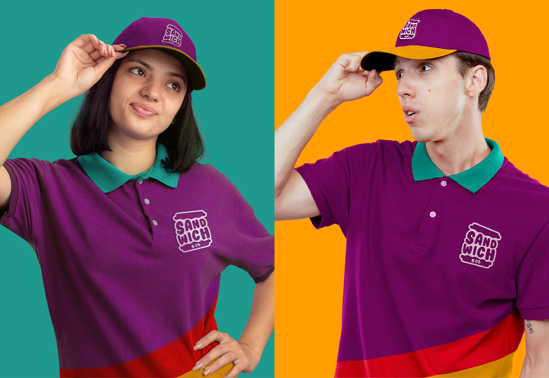
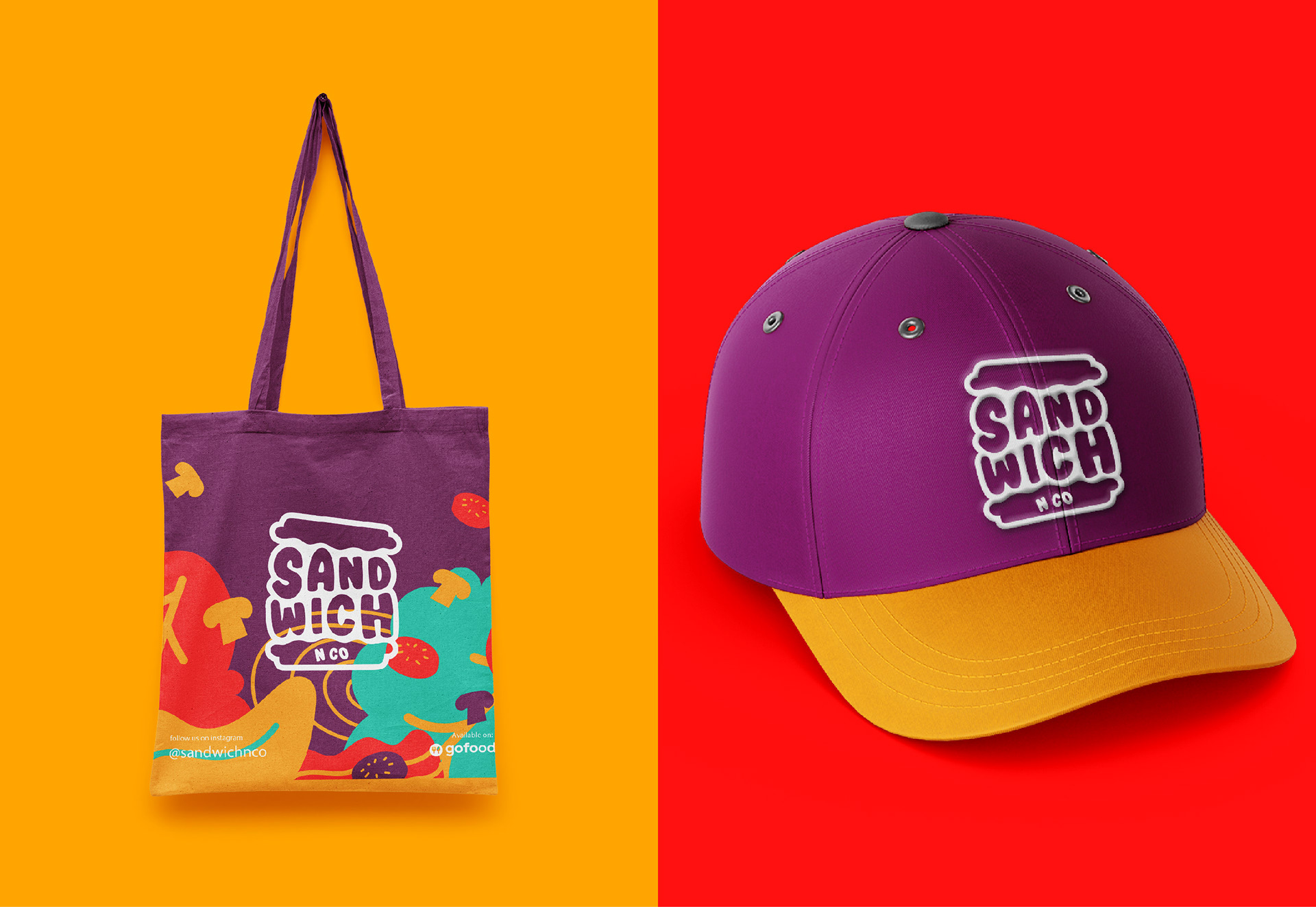
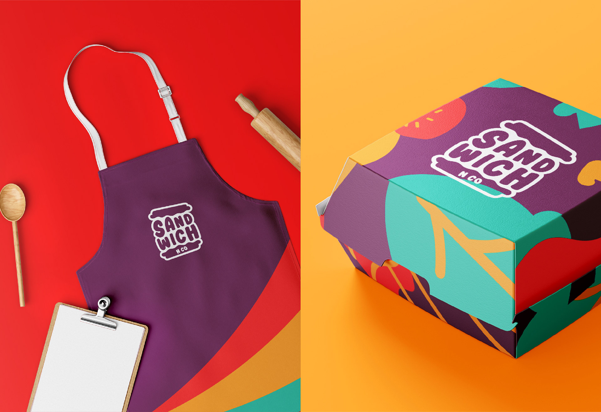
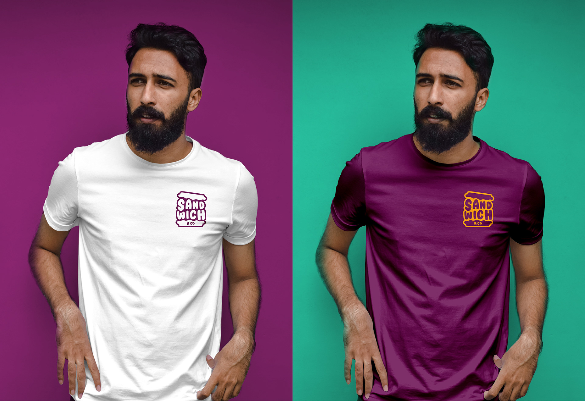
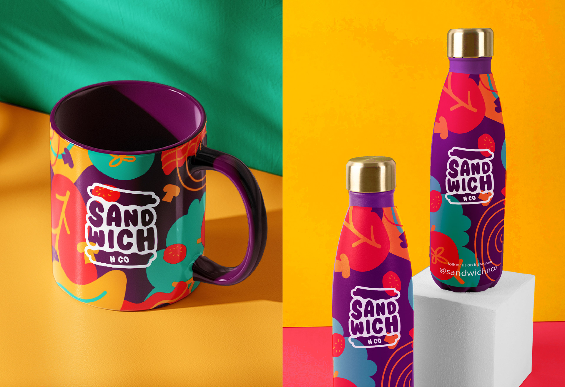
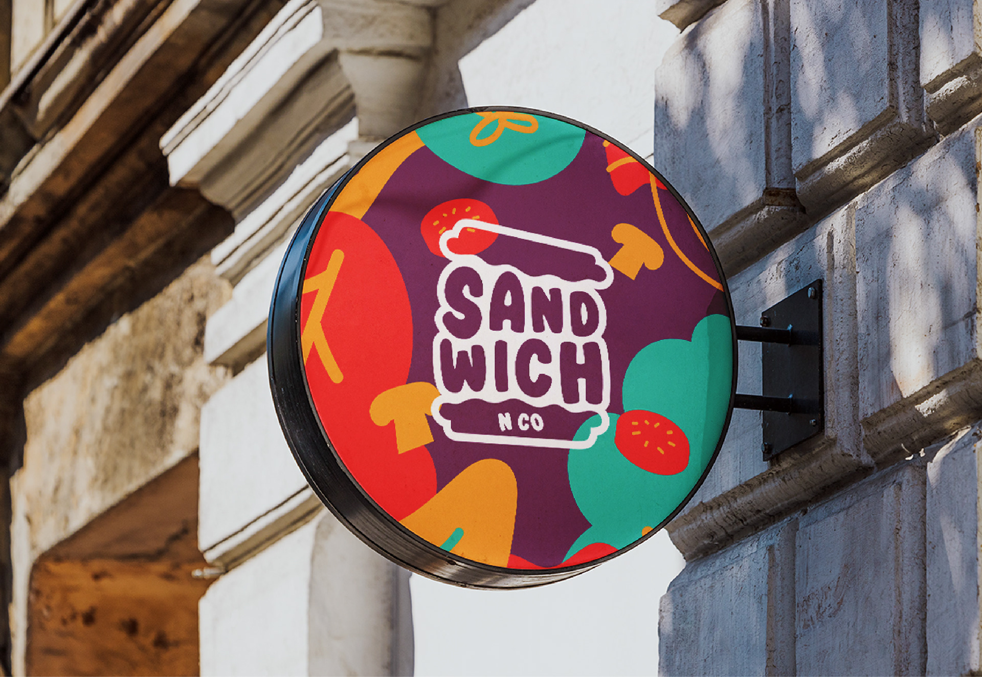
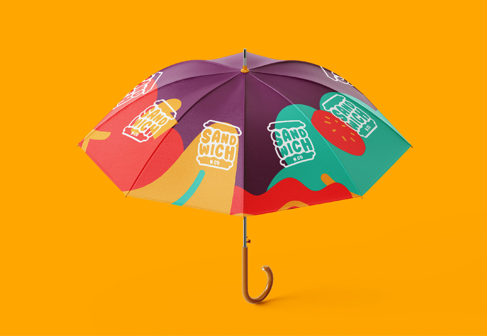
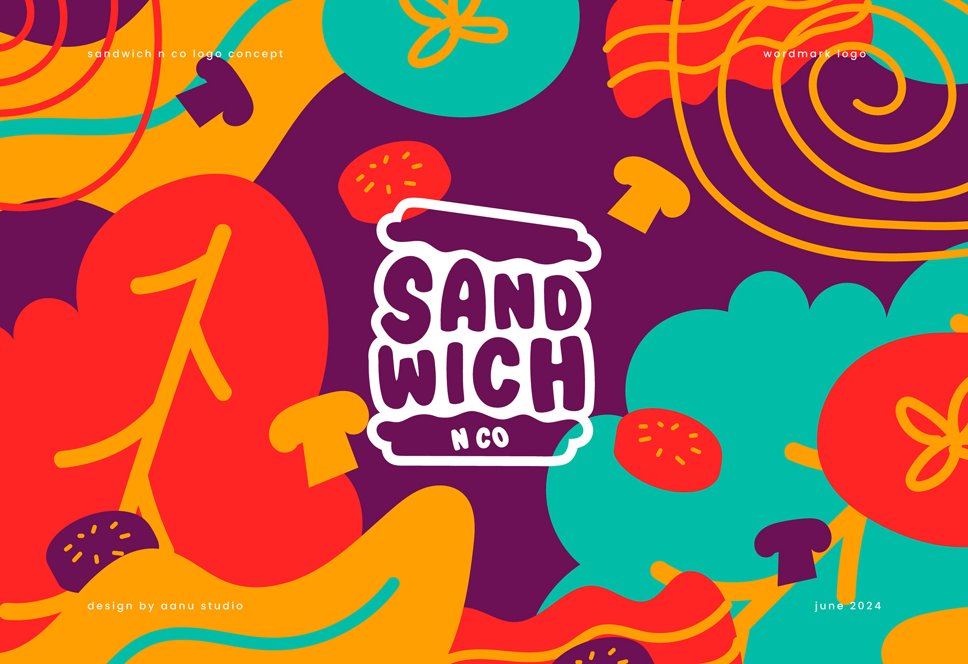
Sandwich N Co's visual identity bursts with vibrant colors and playful illustrations, embodying the essence of their delicious burger creations. The brand's color palette is a lively mix of bold purple, juicy reds, fresh green and appetizing yellows, evoking freshness and culinary excitement. Central to their visual identity are whimsical illustrations of burger ingredients: plump tomatoes, crisp lettuce leaves, succulent beef patties, and fluffy burger buns. These illustrations not only decorate their packaging and promotional materials but also serve as a visual shorthand for the quality and variety of ingredients that define Sandwich N Co's offerings.
Every aspect of Sandwich N Co's visual identity reinforces their commitment to crafting mouthwatering burgers that are as visually appealing as they are delicious. Whether it's their logo, adorned with stylized burger elements, or their menu boards adorned with colorful depictions of savory toppings, each design choice reflects their dedication to creating an engaging and memorable dining experience. Through vibrant colors and delightful illustrations of burger ingredients, Sandwich N Co's visual identity not only attracts hungry customers but also communicates their passion for crafting burgers that satisfy both the palate and the eye.