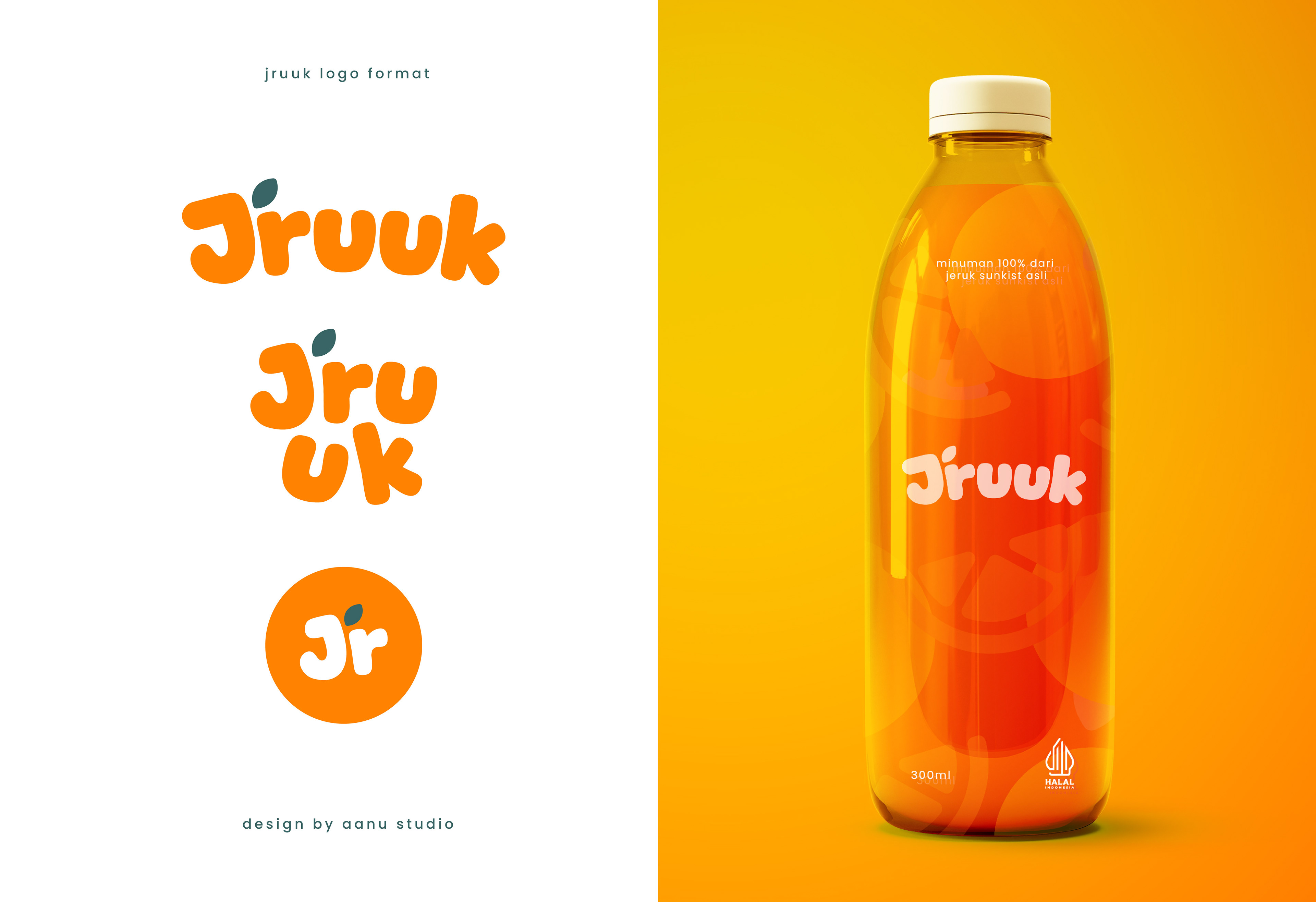
Jruuk
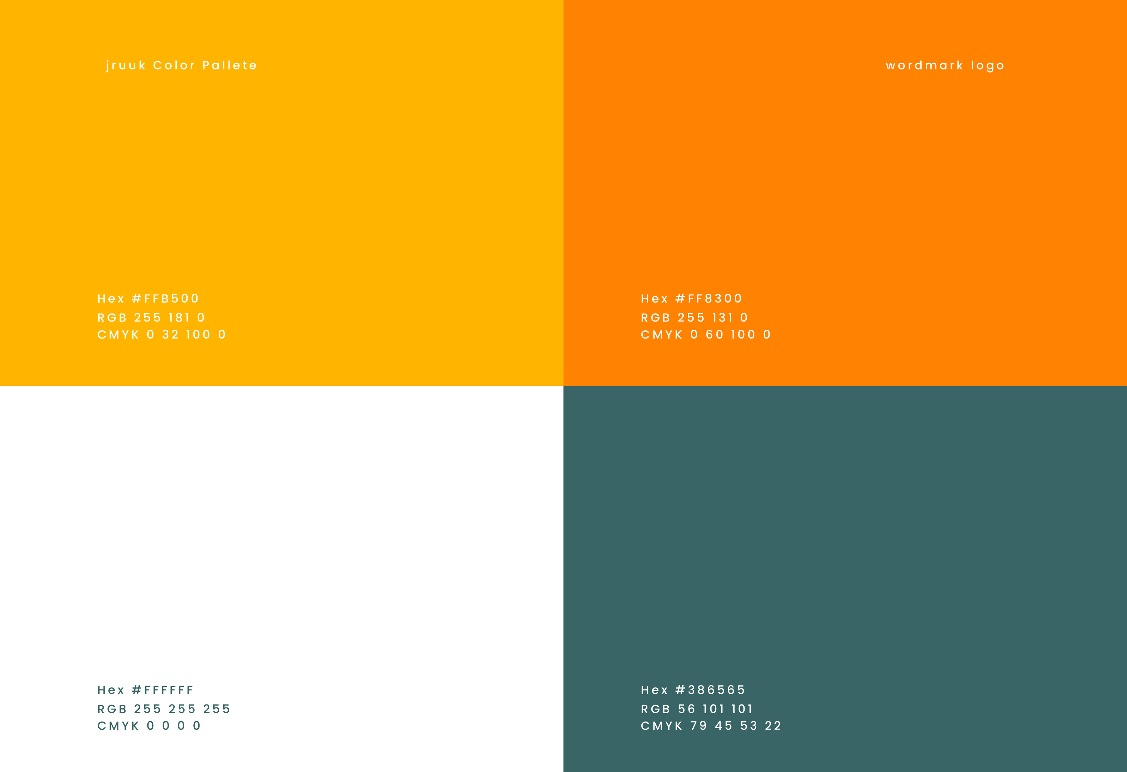
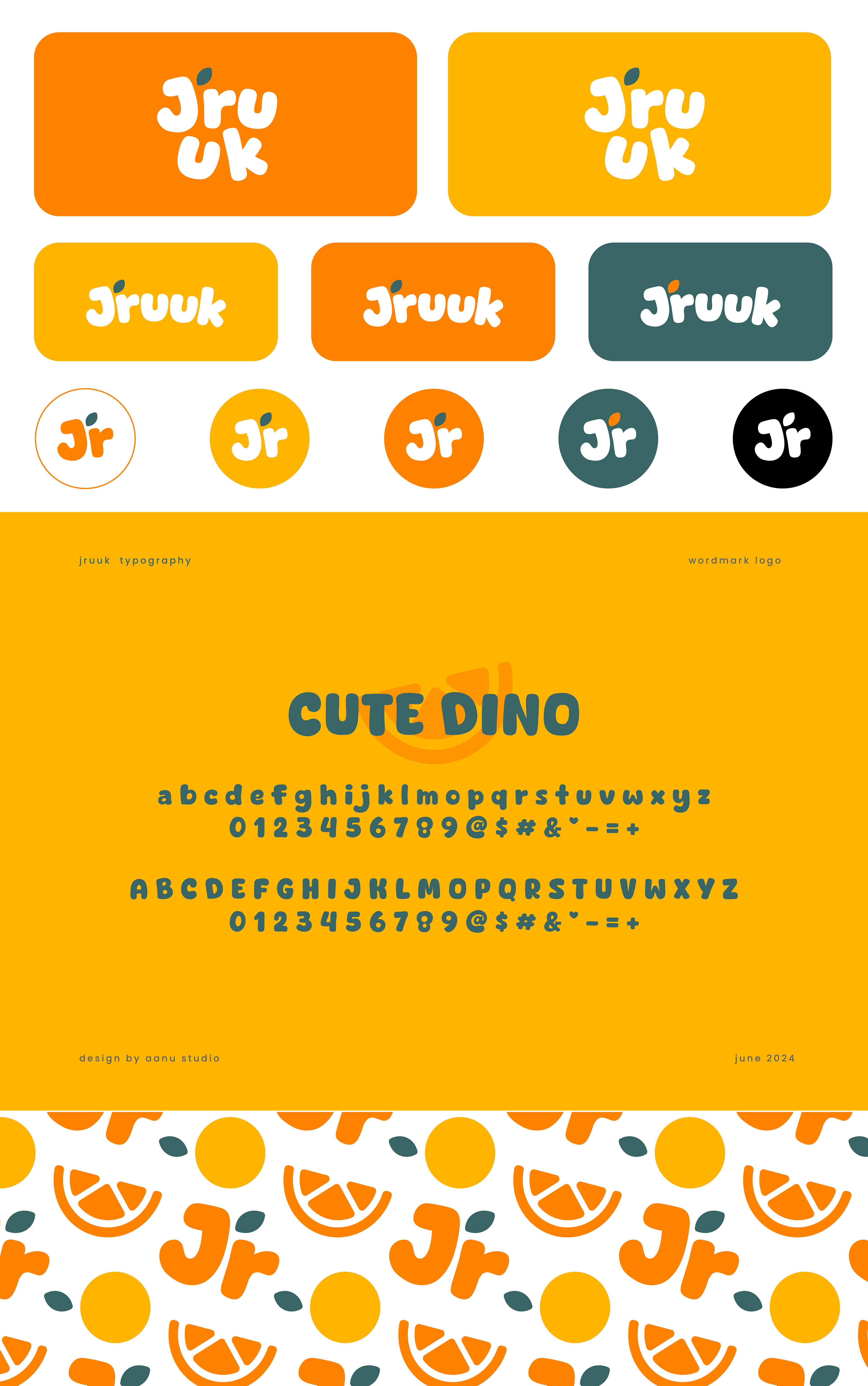
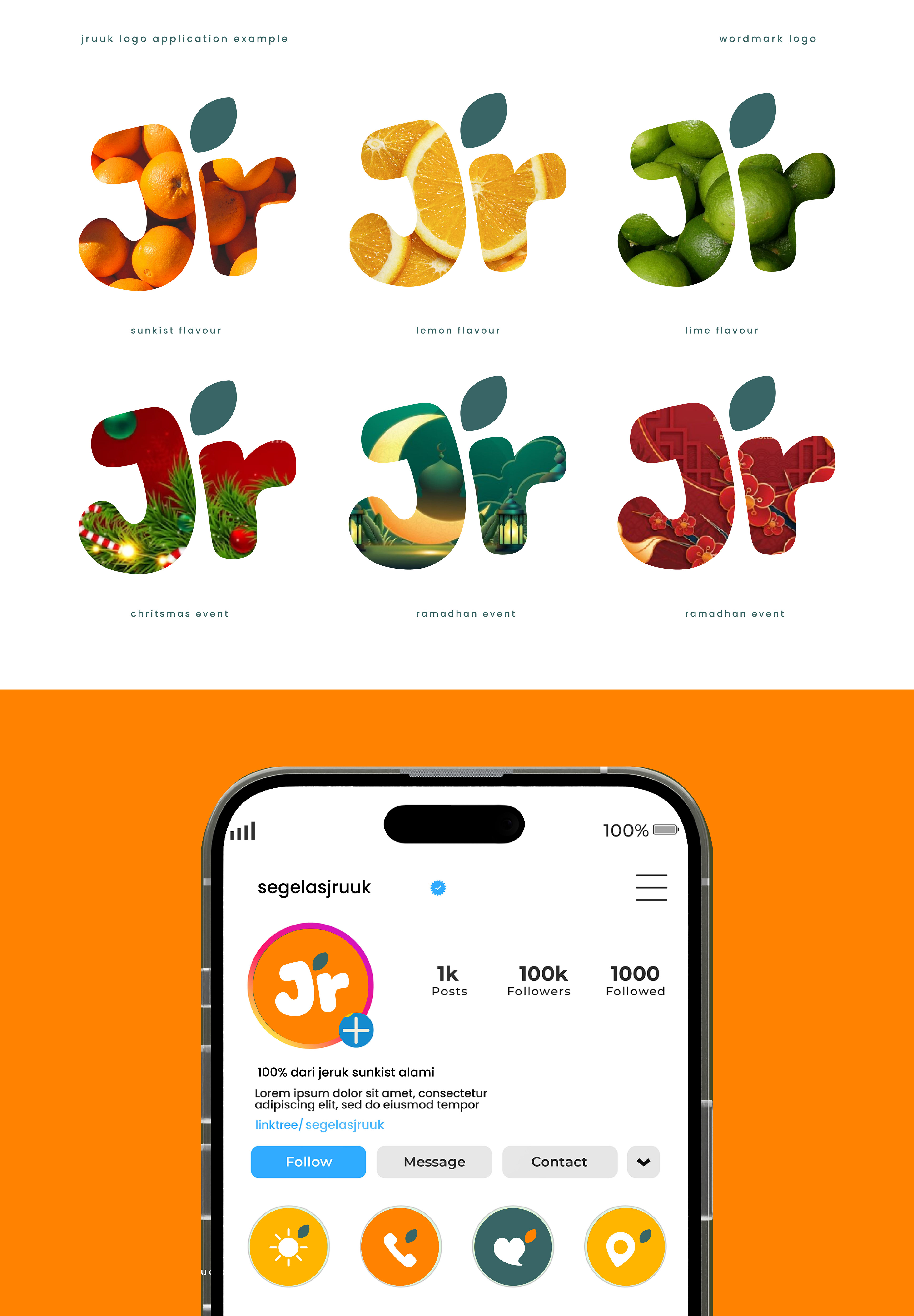
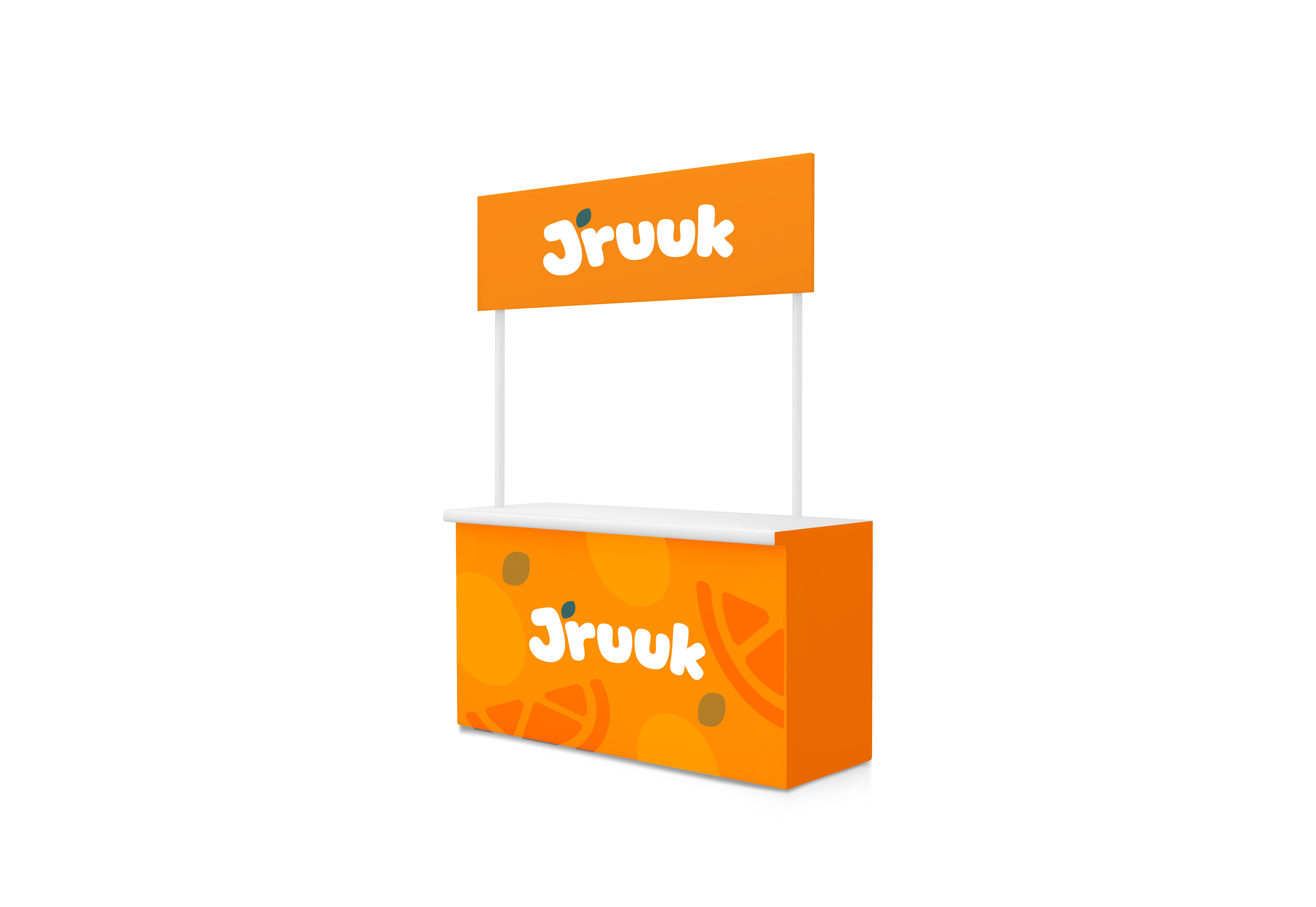
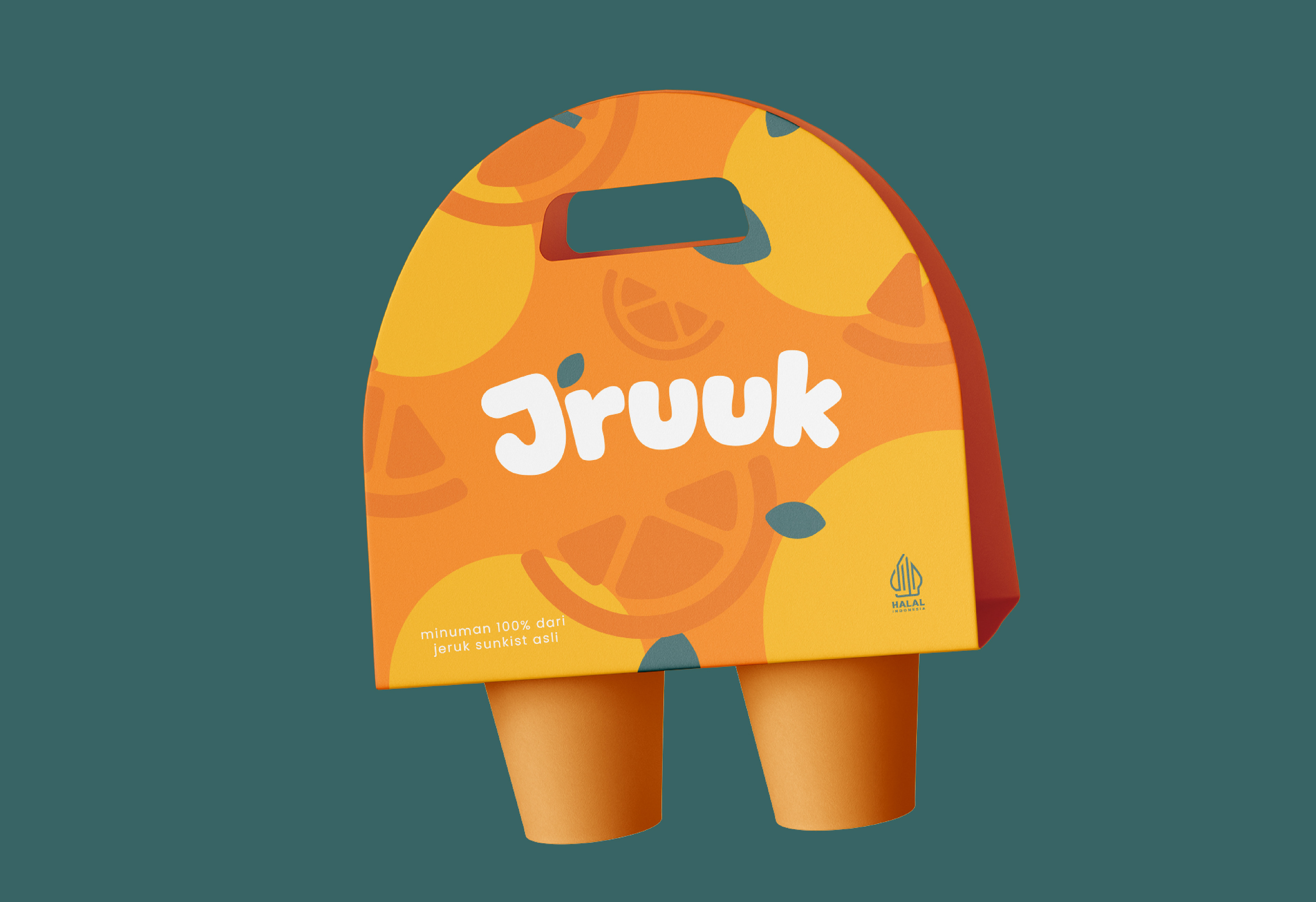
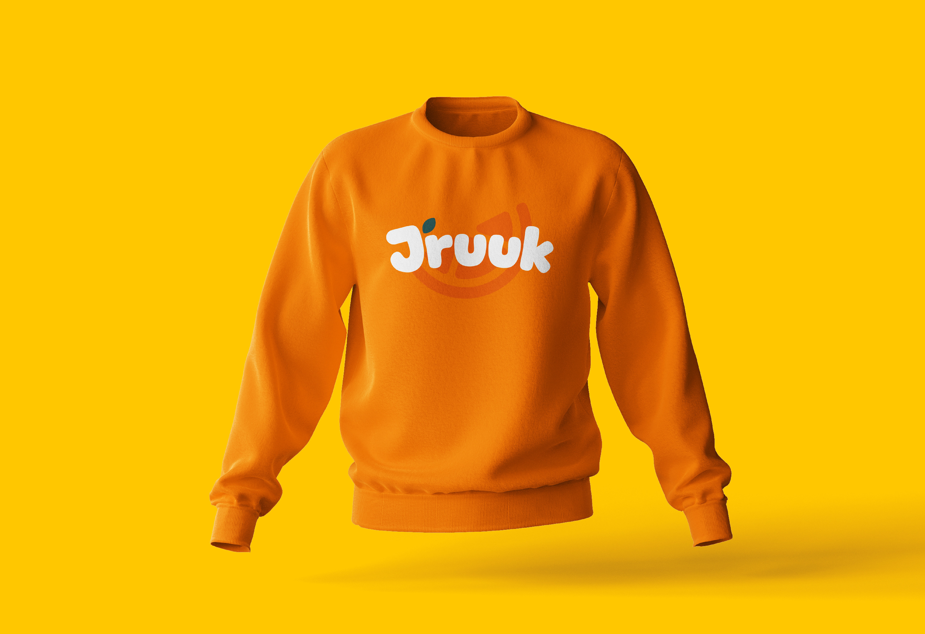
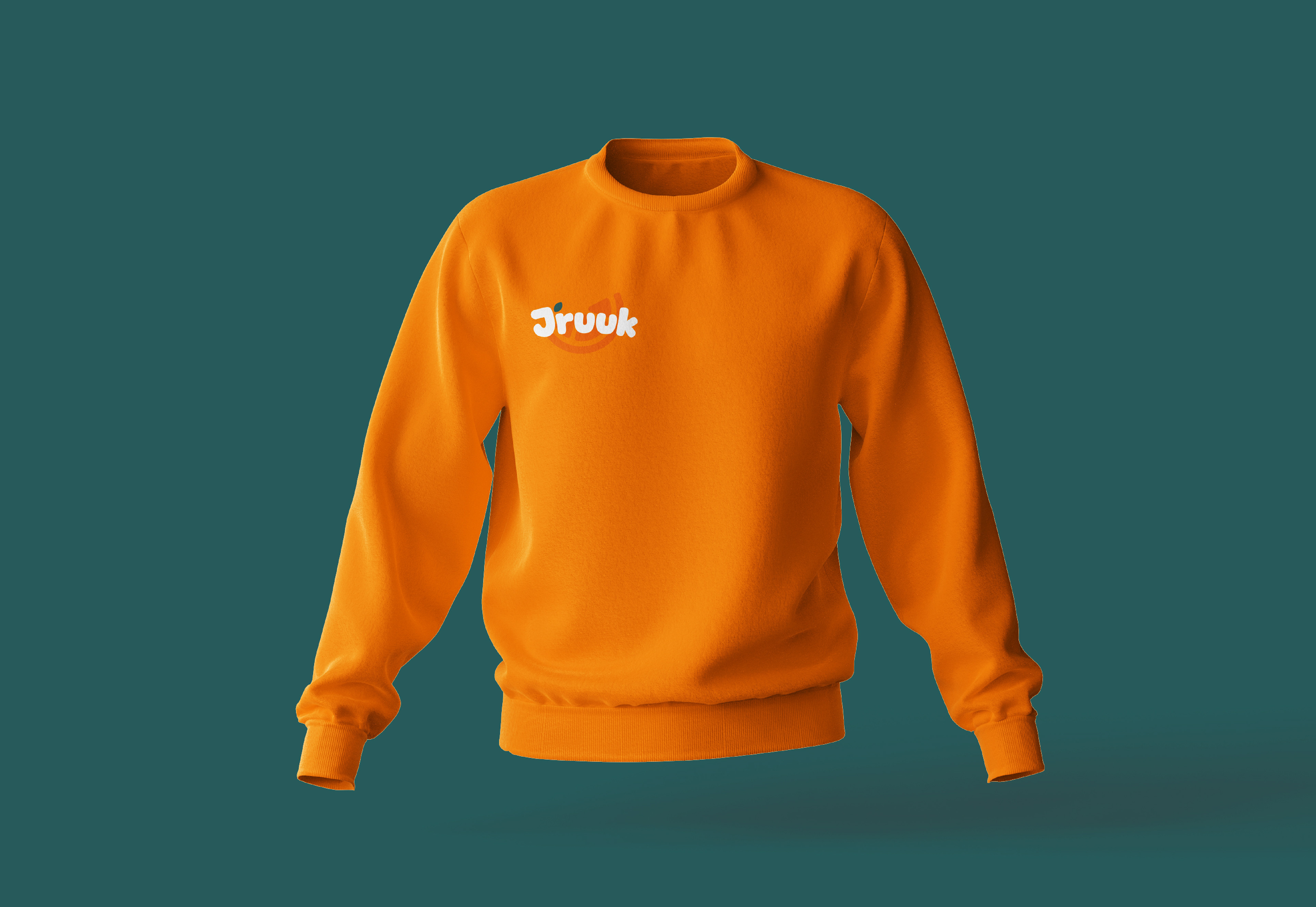
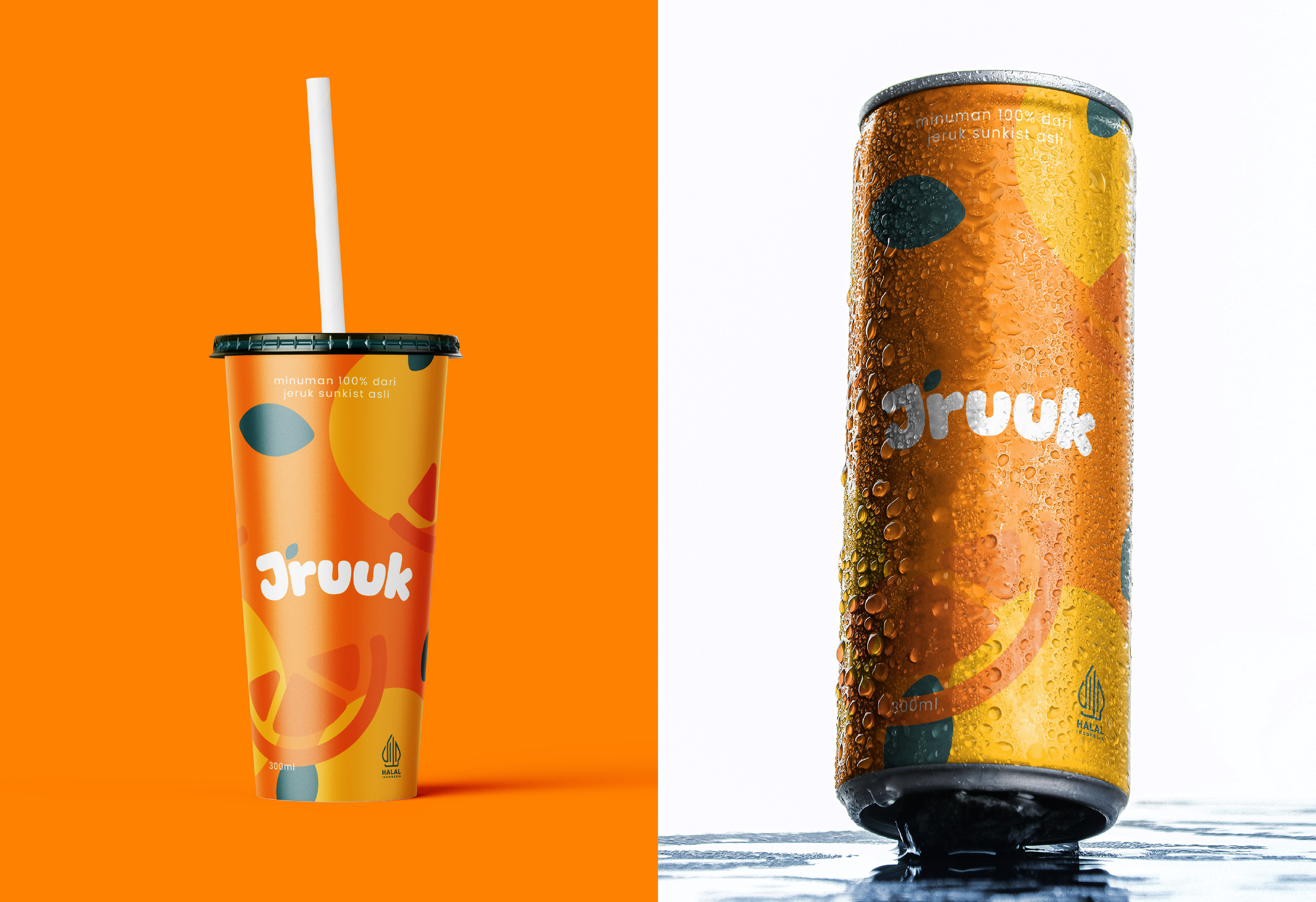
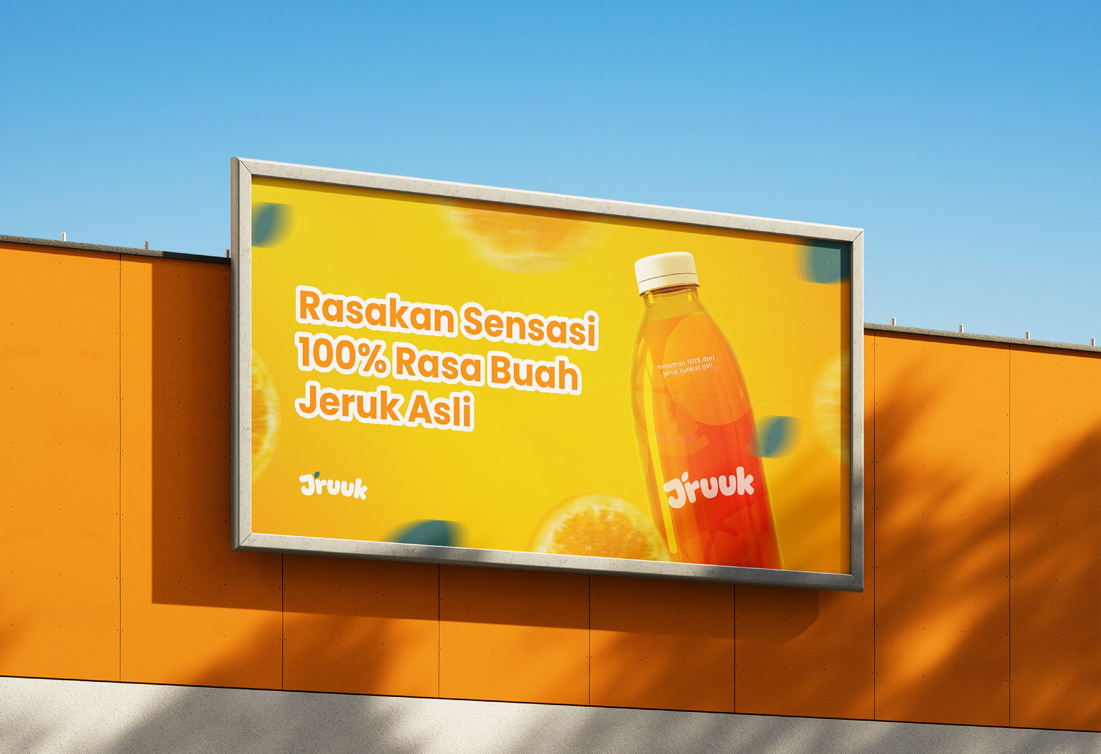
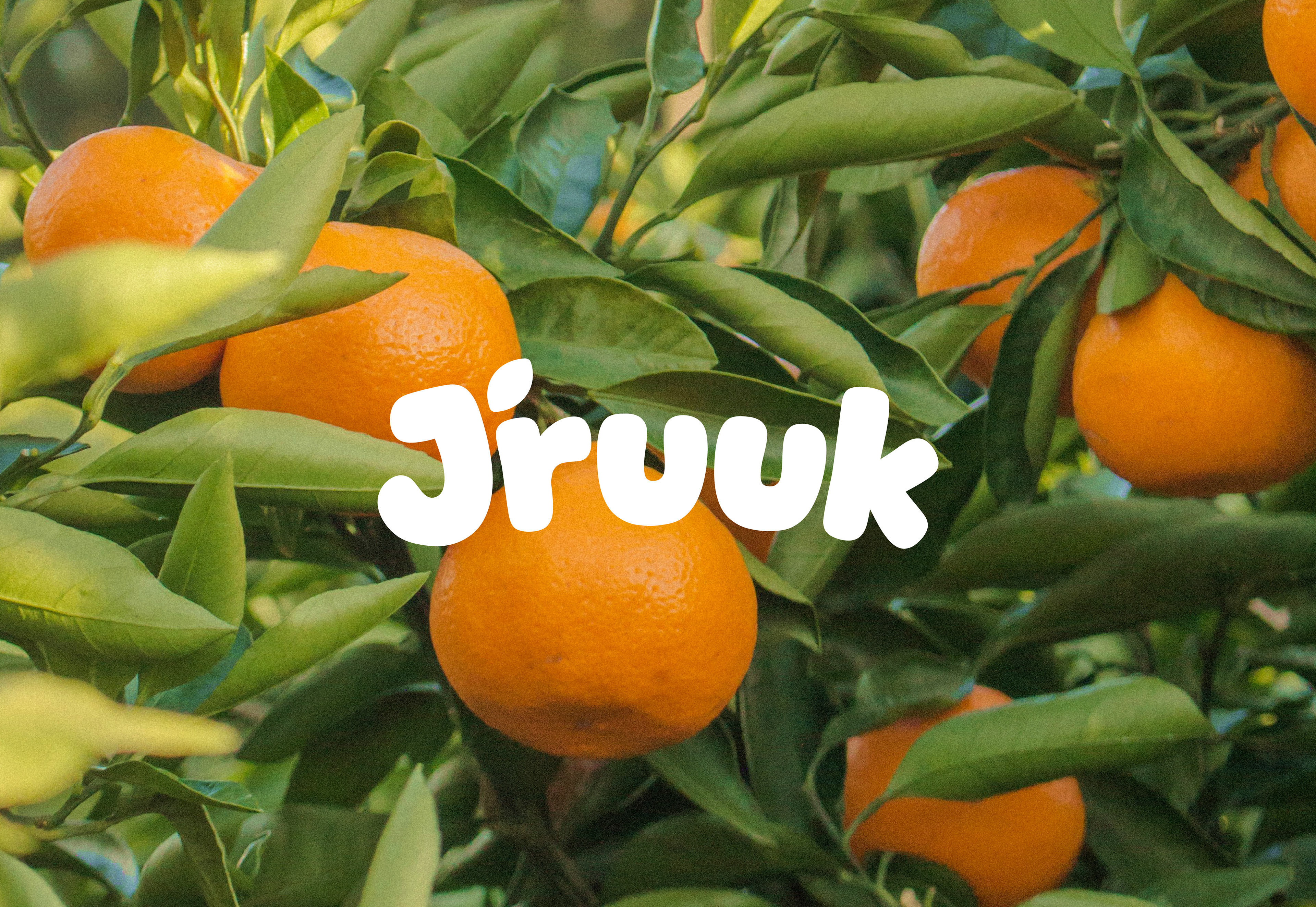
Jruuk's visual identity radiates with vibrant orange and green hues, vividly capturing the essence of its flagship product: Sunkist oranges. The brand's color palette mirrors the fresh and tangy appeal of Sunkist oranges, with bright oranges symbolizing zest and energy, complemented by refreshing greens evoking natural vitality and health. These colors not only adorn Jruuk's packaging and marketing materials but also infuse their retail spaces, creating an inviting atmosphere reminiscent of sunny citrus groves.
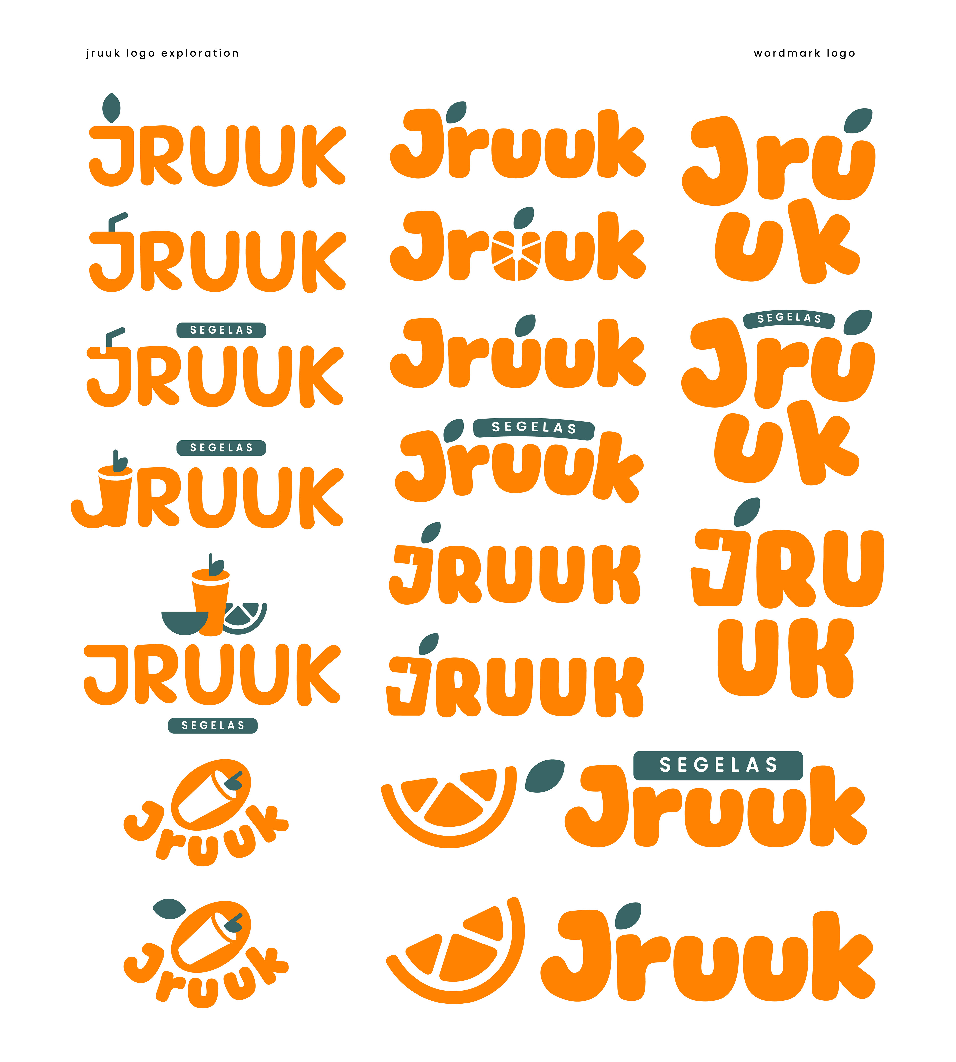
Central to Jruuk's visual identity are evocative illustrations of Sunkist oranges: juicy segments bursting with flavor, vibrant orange peels exuding freshness, and lush green leaves hinting at the fruit's natural origins. These illustrations are meticulously crafted to celebrate the premium quality and juicy appeal of Sunkist oranges, reinforcing Jruuk's commitment to delivering a wholesome and delightful citrus experience. Through its distinctive use of color and evocative imagery, Jruuk's visual identity not only captures the essence of Sunkist oranges but also invites customers to savor the refreshing taste and vibrant spirit of their citrus products.